Introducing readers to the breadth of our digital products
The Times has an increasingly robust bundle of digital products extending beyond news. However, at the time this test ran, a user could spend quite a while on nytimes.com without seeing any indication of the rest of the bundle. The Activation team was exploring ways to improve newly registered users’ awareness of our other products.
This was also the height of the pandemic (summer 2020) and we were increasingly hearing a desire for more “take a break” content from readers.
Role
UX Design, Visual Design, Facilitating Research
Collaborators
Researchers, Product, Engineering, Data, Copy Writer, Design & product from the Cooking team, Design & product from the Games team
Outcomes
27% increase in Cooking free trial starts
Adoption of this concept across the company
Where?
For this test, we wanted to find places in the existing customer journey where users might be open to learning about other products. I didn’t want this to be something annoying to users — like a popup or overlay, but rather part of their natural exploration of the product.
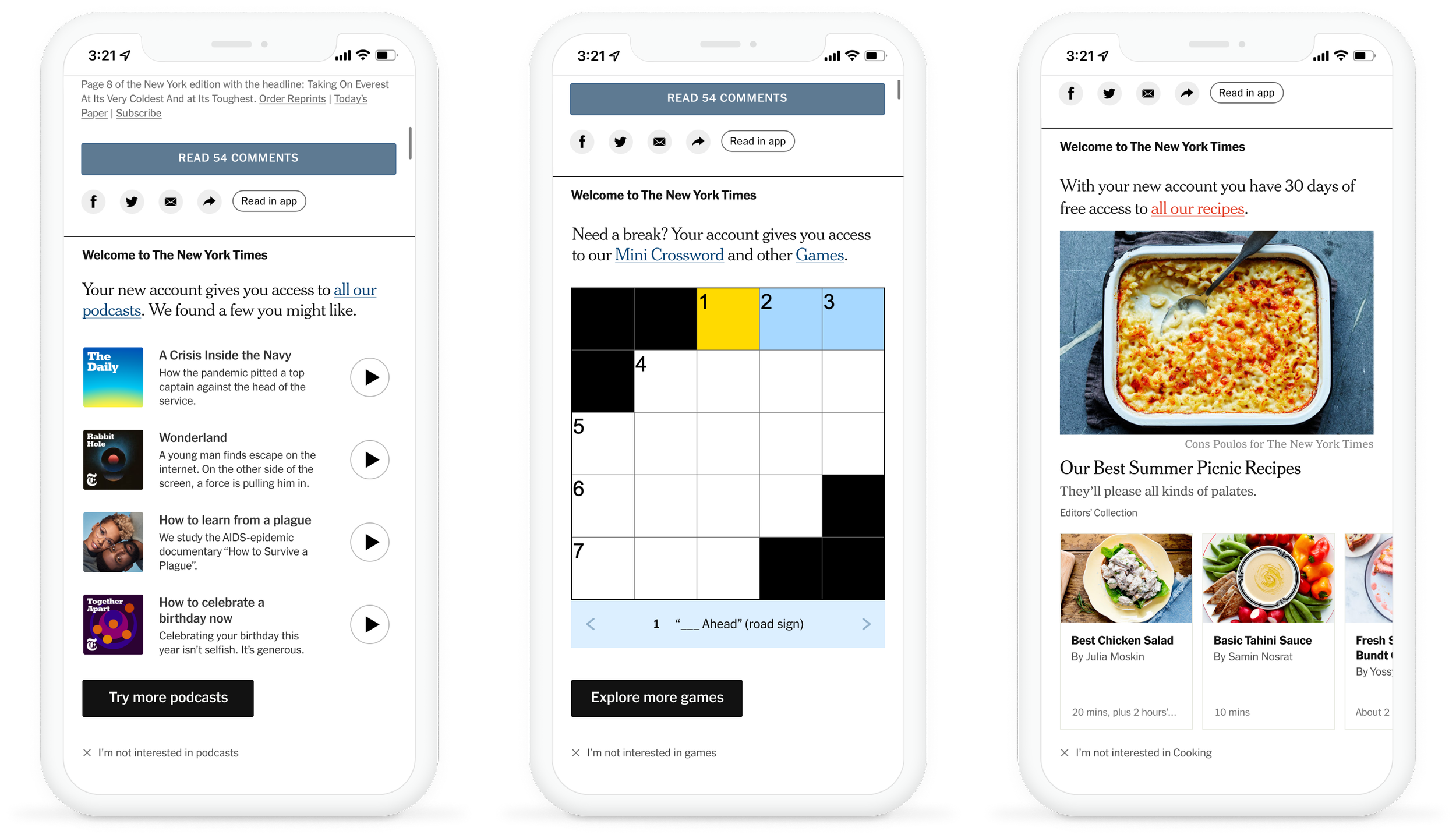
Given these constraints, I decided to explore what we could to at the bottom of our articles. Previously this was devoted to recirculation of related and popular stories to users, with the goal of driving a second article click. I wondered what might happen if we showed recipes, games, newsletters or podcasts in this space. Since it’s at the bottom of the page, we can assume users are fairly engaged with us and not in a hurry if they make it this far.
Explorations
selling the idea
I designed a series of provocations promoting Cooking, Games, Podcasts and “Best of” content in this space. My product partner and I then presented this concept at the “Forge” — an informal meeting to show new test ideas to Growth leadership. Getting buy-in from design leadership within the Growth mission helped facilitate running this test on the story page — a place Growth had not done much testing in the past.
We called this unit the “Activation Block”
User Testing
I collaborated with my research partner and a facilitator to conduct a day-long round of user interviews looking at several of these approaches. We intentionally placed the activation block at the bottom of an article about Coronavirus so that we could get a sense of how readers felt encountering this on a serious article. We have tragedy tags to avoid placement on extremely sensitive articles, but wanted to gauge its performance on medium-serious content.
Users were given a complete story page to interact with. A different activation block was at the bottom of each story.
Findings
The inclusion of the Activation Block succeeds in increasing the awareness of The Times’ richer offering. Even long-time registrants found something new and relevant.
Of all of the experiences presented, the ‘Best of the Times’ worked the hardest in delivering new, engaging, and relevant content, regardless of their personal preferences.
Cooking was especially impactful at raising awareness about a product that users were completely unaware of. Some liked the breadth of recipes while some felt it was overwhelming.
Some participants were confused by the “take a break” content being placed on a news article while others appreciated it.
First Test: Cooking
While the “Best of The Times” approach was the most appealing to users, product leadership felt the Cooking version would be easiest to test and would align best with our goal of increasing awareness of our other products. I agreed with this approach and focused on refining the cooking experience. To do this, we worked closely with the Cooking team to select content and approve visuals. While at first the Cooking team wanted to pursue an approach that looked more like an ad, I felt strongly that the power of this unit would be its native feel.
Based on the user research, we designed a multivariate test that would investigate the impact of a small Cooking block versus a big takeover.
Results
The large takeover was the winner, resulting in a 27% increase in Cooking free trial starts.
We had hoped to see halo conversion of paid cooking starts go up, due to increased awareness. However, for this first test, we were only able to show this experience to users once. We believe users will need to see the same iteration at least 3 times before registering it cognitively.
This concept of promoting our other products in recirculation and homepage placements has been picked up by teams across The Times.
I have consulted/advised on several follow up tests run by other teams.


