Balancing business goals with user needs in onboarding
When a user tries to read an article on nytimes.com, the “regi-wall” prompts them to create a free account to keep reading. After they register, we take them through a series of onboarding steps before sending them back to their article. I maintain this registration flow with my team, and have tested and iterated on it extensively.
I have learned that the most successful interventions achieve our business goals by speaking to a user need in the right moment. Below you will find some documentation of the flow, as well as some of our most informative tests from the past few years.
Role
UX Design, Visual Design, Research Facilitation
Collaborators
Product, Engineering, Data, Research, Copy Writing
BAU Registration flow
Documentation
There are many scenarios that can unfold when a user logs in or creates a new account. My team is frequently asked to explain these flows, so I created a series of diagrams to explain the overall user flow, as well as what surfaces our team maintains.
Download the App Testing
At the end of the onboarding flow we ask users to download the app. When I started, the app download step (at left) prompted users to go to the app store. This leaves users unsure where they’ll end up once they download the app. Keep in mind that these users are still in a moment of hard friction, attempting to get back to their article. I had a hypothesis that showing users they would be deep-linked directly to that article within the app would make the action feel easier.
Results
292% increase in clicks to download
21% increase in app logins (before magic linking implementation)
Magic Linking Iteration
Additional testing reassured users that they we would automatically log them in once they download the app. Messaging improved intent to download the app by 2%. Functionality + messaging resulted in 92% increase in users immediately populating newsreader apps.
Interest Collection Tests
We’ve run several tests exploring interest collection in onboarding. We hypothesized that allowing users to tailor their experience based on topics of interest would improve their engagement with the product and eventual conversion. I collaborated with the newsletter team on several iterations of this concept. Ultimately, we learned that interest uptake in onboarding rarely exceeds 15%, and therefore any further testing with this cohort did not have a big enough effect to justify permanently including it in the onboarding experience.
I have also seen in user testing that readers are frequently wary of tailoring news. Users are also increasingly cynical about data collection and express concern that any customization will simply be used to serve them ads. I’ve come to believe that “interests” are not the most appropriate way to personalize the News reading experience.
Results
Of 660K new registered users exposed to the For You variant, 16% volunteered to save their interests with us. This take-rate is consistent with previous ‘interest’ tests.
The observed 4 week start rate in For You saw a (81% confidence) 3.1% lift in starts, from 1.15% in the control to 1.18% CVR. We may assume there’s no difference in conversion rate.
The observed 4 week return reader engagement rate saw a 13.4% decline in the For You variant, with 95% confidence.
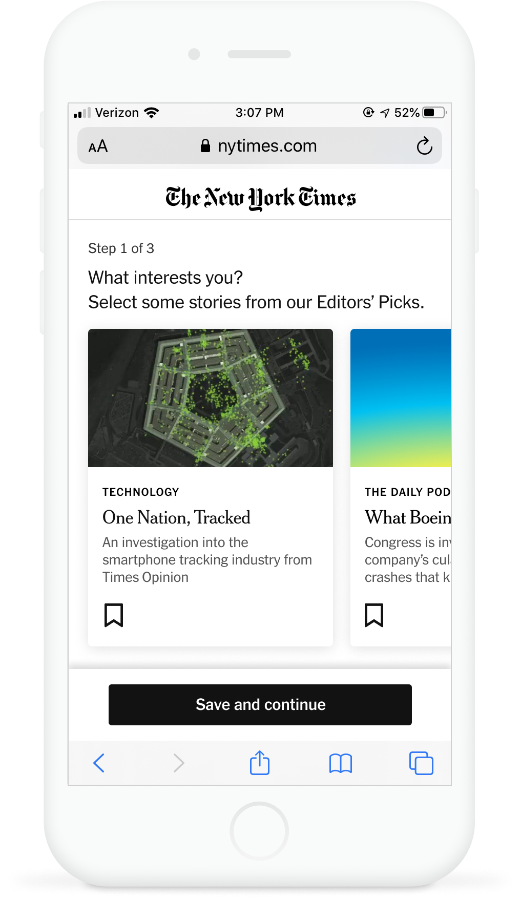
Article interest iteration
An iteration of the above interest test looked at the impact of using articles to demonstrate interests. My hypothesis was that interests like “science” or “world news” can be too abstract and aspirational, and that users might be more able and willing to demonstrate interest in individual pieces of content.
This was a painted door test at first (not hooked up to anything on the backend) to determine whether we would have a higher take rate.
While I think this hypothesis has merit, and it has informed later work, this was ultimately not the right moment for this type of experience. I believe it was too much content for users to engage with in a moment of friction. Take rate did not improve compared with control.
Products in Get Started (2021)
We have been looking for ways to gather signal on which users might be interested in our other digital products (Cooking, Games, Wirecutter, Audio).
I designed a simple step in onboarding that would allow users to select content types they like, including ones that mapped to our core digital offerings. This was a preliminary test to see how many folks would demonstrate an interest in media type. In the future, we may return to this step, with more focused visuals expressing the Cooking, Games, and Wirecutter brands.
User Testing
While exploring this concept, we did some user testing with wireframe prototypes. This helped us determine which content types to focus on, as well as some of the framing. We learned that the copy “tell us about yourself” made users feel as if this was for The Times, not for them. They worried we were just trying to track them
User testing concepts and explorations
Over the years I have explored many improvements to the flow, many of which never made it past user testing. Here are some of my favorites that got left on the cutting room floor.
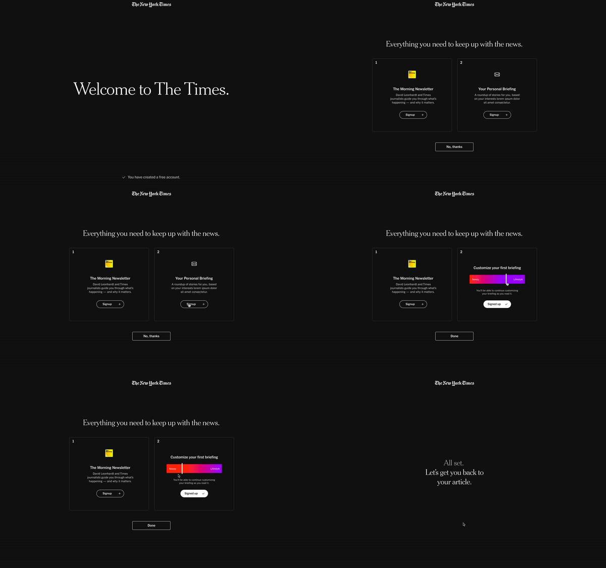
Get Started quickly + dark mode (2021)
Onboarding, but make it faster. The simplicity of the personalization and signup flow was appealing to users, though some of the interactions needed fine tuning. I still think this idea has merit but it didn’t end up making it to the top of our priorities.
The “dark mode” aesthetic was extremely appealing to users. Many noted that it helped them understand that this was an interstitial moment and that they would get back to their story after it ended. Based on this insight, we did a simple A/B test of light to dark mode. The dark mode version did not beat control. However, we have a hypothesis that it lost because the steps before onboarding couldn’t yet be shown in dark mode. It’s in our backlog to explore this further.
Election Onboarding (2020)
I wanted to explore ways to make the onboarding experience feel more like a useful tool for users signing up on election articles. In user testing we saw that the flow felt too long and arduous to folks. Some of the ideas were appealing (follow specific storylines) but it wasn’t exciting enough to demand prioritization in our roadmap, especially given that allowing users to follow a storyline would be a new capability to build out.


